



Rebuilding around the visitor.
By 2022, Fight the New Drug's website had outgrown the categories it was built around. As new programs, articles, and resources were added, they competed for space in the main navigation. The site increasingly reflected how we organized our work rather than how visitors looked for information and help.
The redesign needed to go beyond a visual refresh. I started with a simpler question: What did people come here to do? That meant understanding the questions and misconceptions bringing visitors to the site, moving beyond legacy content categories and internal programs, and creating clearer paths to what people were actually looking for.
The Problem & Opportunity
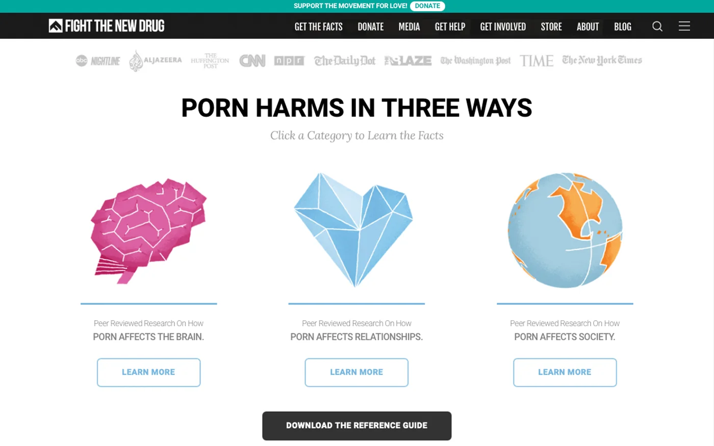
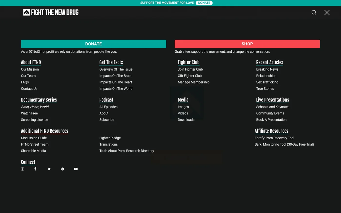
When I took over the website in 2016, its content was organized around Brain, Heart, and World: the effects of pornography on individuals, relationships, and society. It was a useful framework for explaining the issue, but not necessarily how visitors looked for information or help. As our articles, resources, and educational programs expanded, so did the requests for space in the navigation. The menu was trying to do too much, and adding another link wasn't going to make it more useful.
Research & Strategy
I reviewed Google Search Console queries, social media comments, and recurring questions from contact forms to understand what brought people to the site. I also looked at analytics and internal site-search data to see what they looked for once they arrived.
Three audiences stood out: concerned partners, people looking to quit, and parents seeking guidance. Despite different circumstances, they shared two needs: understanding the issue and finding help.
Navigation & Information Architecture
I rebuilt the navigation around those shared goals, using mega menus to organize resources without overwhelming the top-level menu. Learn and Get Help served the primary needs of new site visitor, with Get Involved offering a third path for those already familiar with FTND. Presentations retained a direct link as one of our flagship educational programs. Donate and Shop remained prominent in the header as important revenue streams, while organizational information moved into a secondary menu. I used first-time visitor analytics to help prioritize placement decisions, balancing what newcomers needed with the organization's goals.
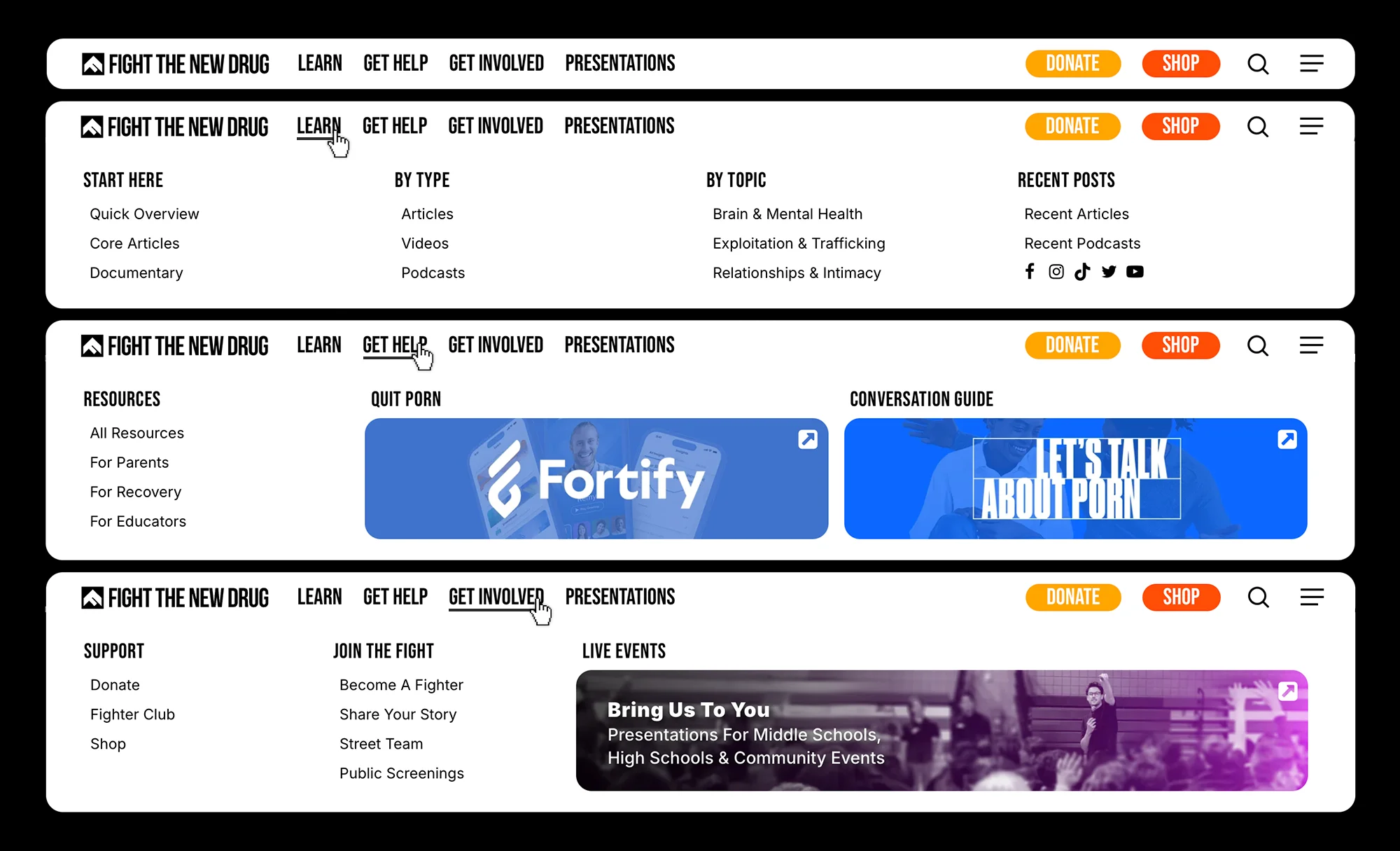
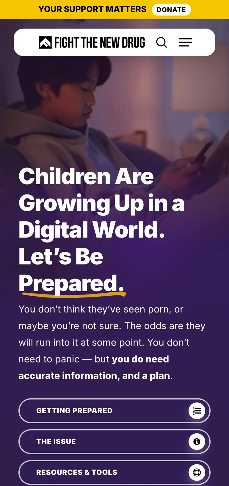
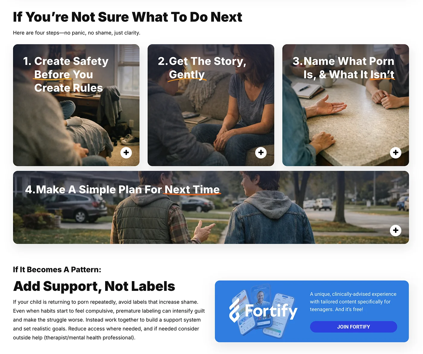
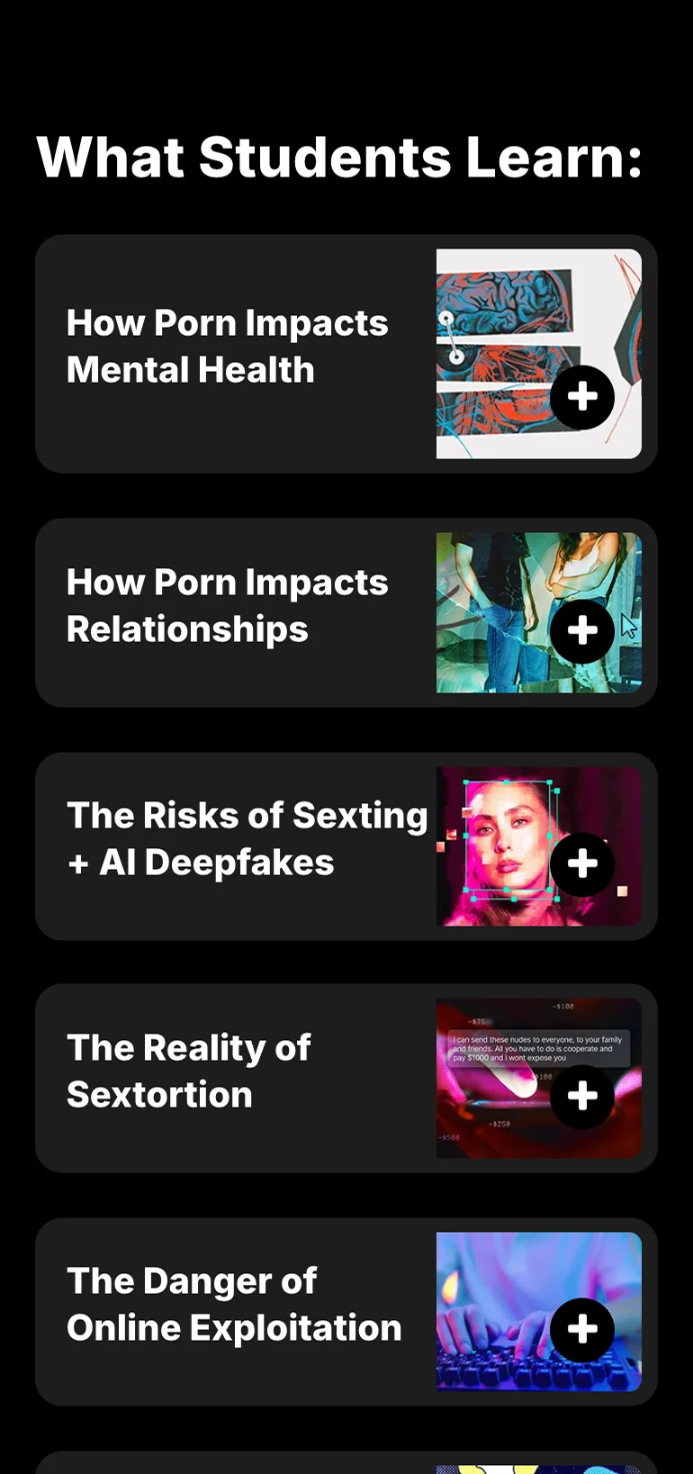
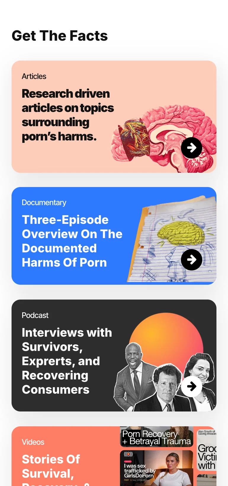
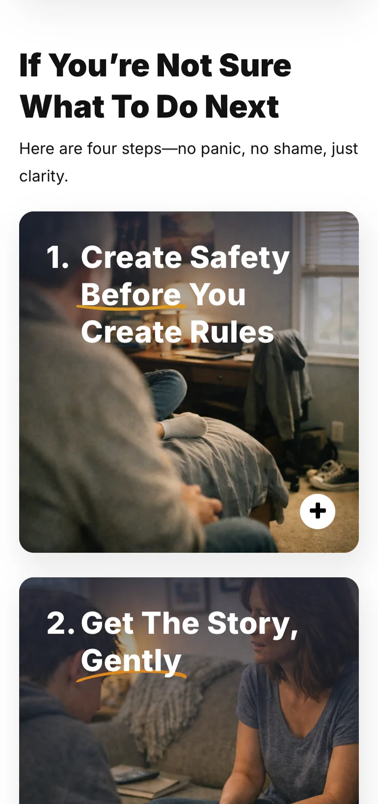
This made the next step clear for visitors while still giving important initiatives a sensible place to be discovered. Supporting the new navigation also meant building guided landing pages for different visitor needs. The Parents Resources guide is one example, turning a menu destination into a more useful starting point.
Homepage & Interface Design
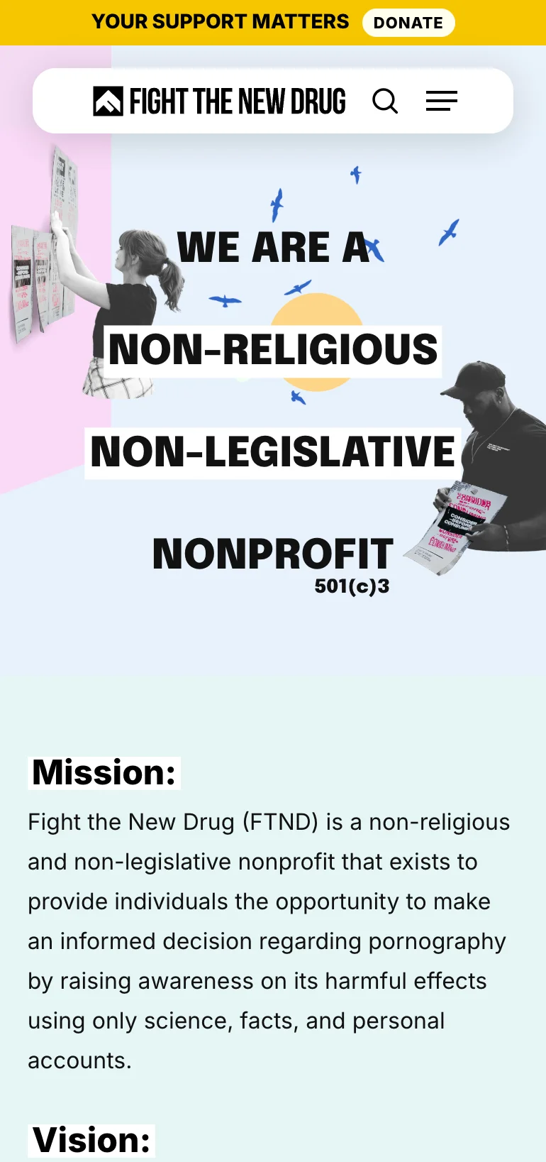
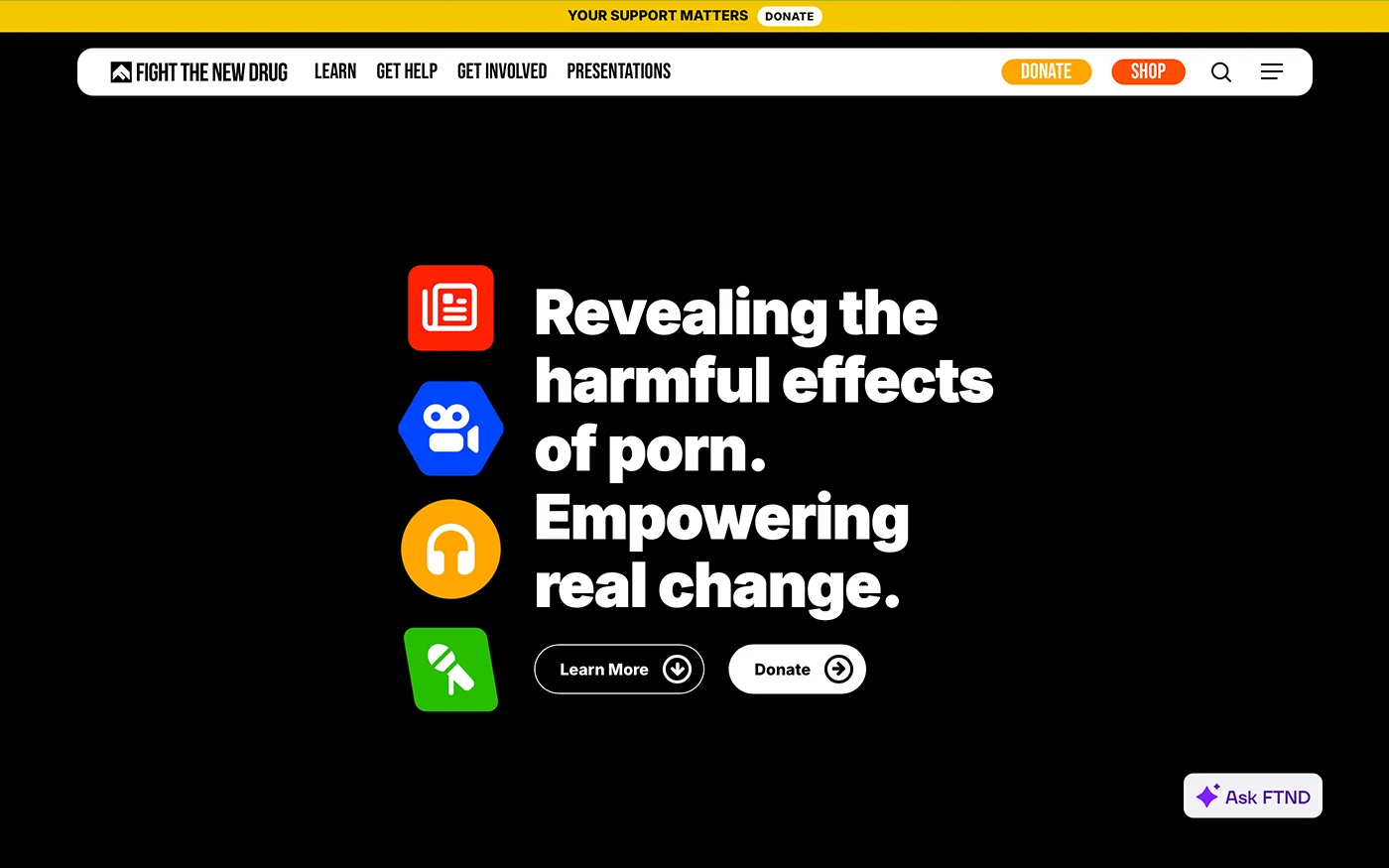
Navigation wasn't the only place we needed to be more direct. The name Fight the New Drug doesn't immediately tell first-time visitors who we are or what we do. The homepage needed to make that clear from the start.
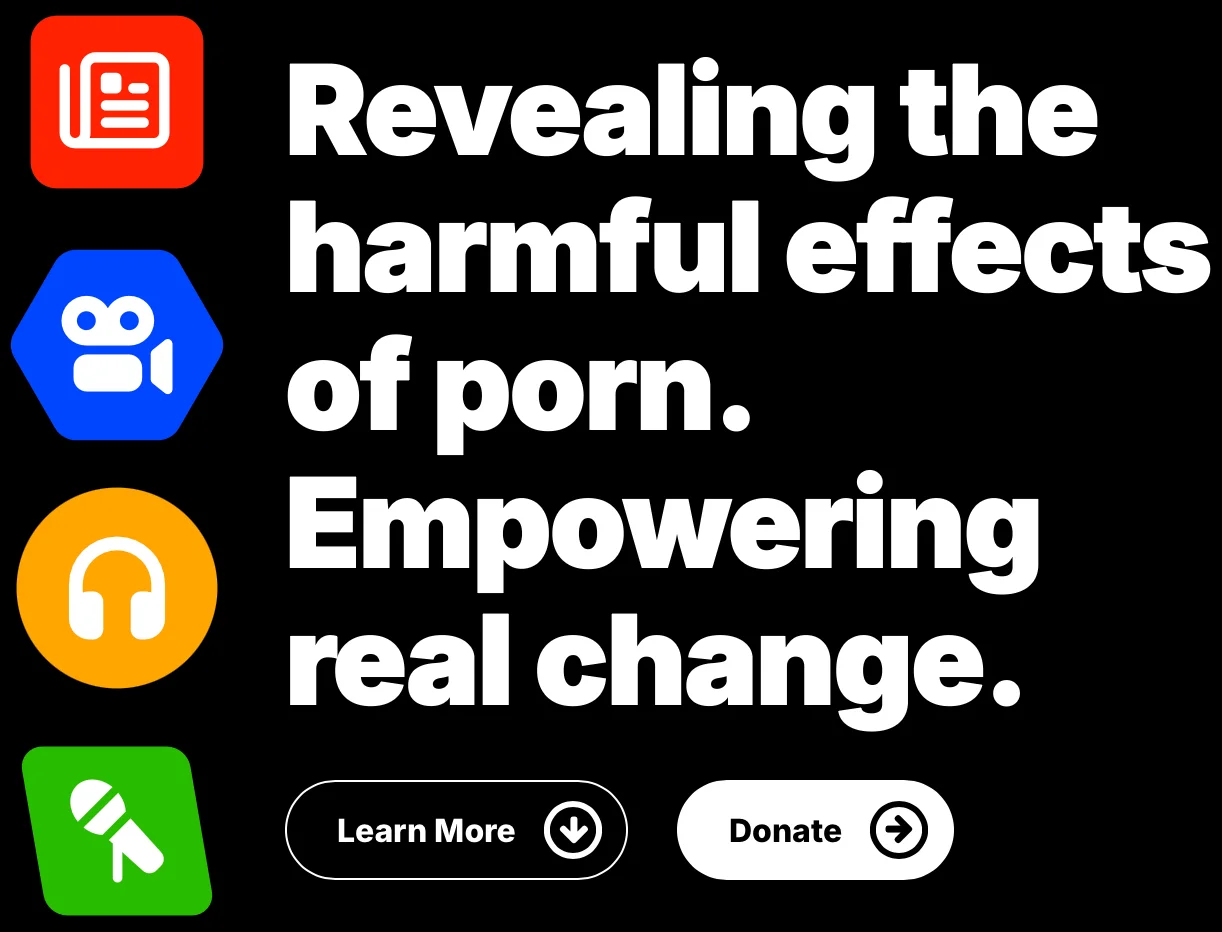
I distilled the organization's mission and vision into a nine-word headline. A Learn More button led into the explainer below, while Donate reinforced our nonprofit identity and gave visitors a clear way to support the work.
Moving from curiosity to understanding
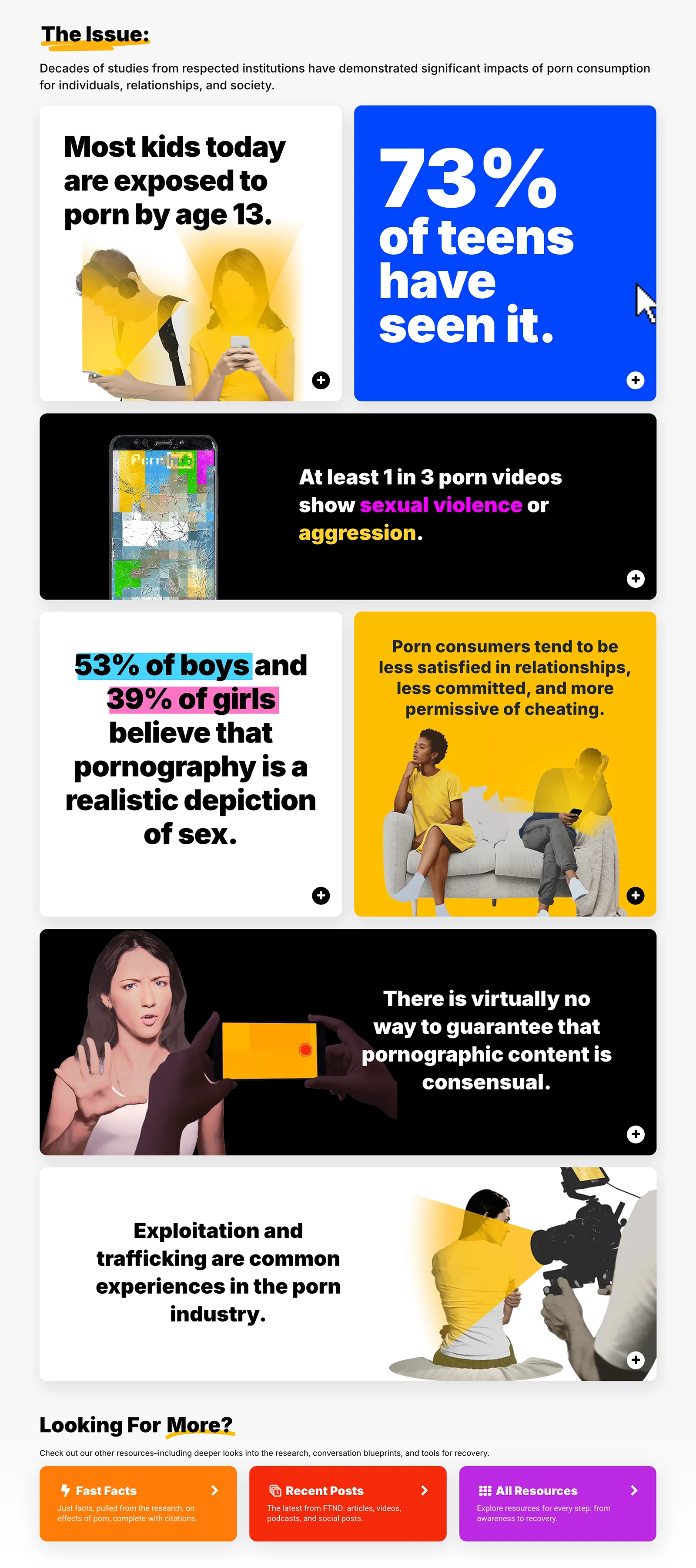
With so much research and educational content to share, the challenge was making the site approachable without sacrificing depth. I built the redesign around interactive flip tiles, using eye-catching headlines and graphics to draw visitors in while keeping more detailed information just a flip away.
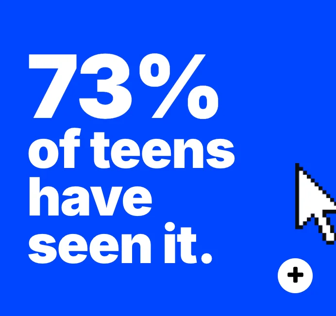
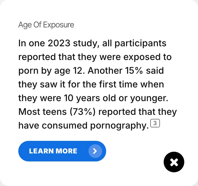
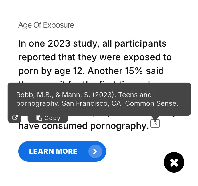
On the homepage, I used this approach to create a carefully sequenced introduction to the issue. Starting with a concern nearly anyone could relate to, each tile built on the previous one, gradually introducing more complex and nuanced ideas without overwhelming visitors.
I developed the content progression, proposed the topics, and designed the visuals and interactions, while research colleagues selected the supporting evidence.
Results & Impact
The most encouraging feedback wasn't about how the new site looked. It was about finding things.
After the rebuild, contact-form messages began shifting from questions about where to find resources to questions about the resources themselves. Visitors also told us the site was easier to use.
Reflections & Learnings
This project reminded me that familiar to the team doesn't always mean intuitive to a visitor. After years working on a site, you know where everything lives because you helped put it there. Shifting focus from where our content belonged to what people came to do led to clearer navigation, a more direct homepage, and landing pages built around their needs.